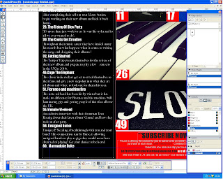
 Music magazine: contents page
2 March 2010
25 February 2010
Question 1: In what ways does your media product use , develop or challenge forms and conventions of real media products?
These are the ways in which my media uses the codes and conventions a music magazine. I recorded the audio of these video's in the radio production suite using Adobe Audition.
Question 2: How does your media product represent particular social groups?
Many examples of the social group represented in my media product are featured on youtube. Below is several examples.
http://www.youtube.com/watch?v=7X-InF5tub0
http://www.youtube.com/watch?UPb0C2wVjQm
http://www.youtube.com/watch?v=BlskboOROkk

http://www.youtube.com/watch?v=7X-InF5tub0
http://www.youtube.com/watch?UPb0C2wVjQm
http://www.youtube.com/watch?v=BlskboOROkk

Question 5: How did you Address/attract the audience?
Question 7: Looking back at your preliminary task, what do you feel ou have learnt in the progression from it to the full product?
I feel that I have learnt alot about the different software used in progression from the preliminary excercis to the full product. I now am able to succesfully use an adequate amount of tools on each of the different software.


These are some articles which I researched to gain knowledge of writing skills:
http://www.prefixmag.com/features/arctic-monkeys/arent-fooling-around-part-1-of-2/12565
http://www.spin.com/articles/kings-of-leon-bigger-we-wanted-to-be
http://www.prefixmag.com/features/arctic-monkeys/arent-fooling-around-part-1-of-2/12565
http://www.spin.com/articles/kings-of-leon-bigger-we-wanted-to-be

5 February 2010
Editing
Editing
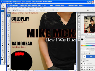
 I edited my puff to make it stand out more. I made it so that the 'win' part was the biggest to sttract the audience. I also added a glow effect around the outside to make it stand out from the page more. I made the title font sans serif to help it stand out.
I also edited the main feature title using an inner and outer glow in order for it to stand out from all the other features further.
22 January 2010
Images: Not used
15 January 2010
Publication Plan
Title: Pause
Positioning Statement: There's nothing like music.
Price: £2.80
Publication Frequency: Monthly
Distribution: Music stores, newsagents, supermarkets and train stations
Rationale: Pause magazine will be based mainly upon gig reports, upcoming concerts and exclusive artist interviews.
Regular content:
10 concerts you must see
a month with...
pause on the radio
pause forum
express it
get to know pause
opininon
Feature Articles:
Kings of Leon highway hit
Metro station kick it off
The rising of Bloc Party
The Kooks get creative
Getting started
Cage The Elephant
Florence and the machine fire
Unsigned
Front Cover Artists:
- The script
- Coldplay
- Radiohead
- Mike Mckay
- The Afters
Housestyle:
Coverlines: Garamond Pro
Headlines: Impact
Standfirst: Impact 11pt
Feature first paragraph: Times New Roman drop capital 5 lines down
Body text: Times New Roman 11pt
Colour Scheme: Red, white and black
13 January 2010
Subscribe to:
Comments (Atom)


